

Silicone Mat Bundle
Pet Accessories Packaging Design
Engineered for Cleaner Floors: The 2-in-1 Training Pad + Silicone Mat Bundle
Project Details
Company
JEM International
Category
Pet Care Accessories
Concept
I developed packaging for a 2-in-1 training pad and silicone mat bundle designed for off-price pet retail. The product needed to build on the training pad system I'd already designed, while making the silicone mat feel like the hero of the bundle instead of an afterthought.
Looking at how potty training bundles were typically presented in-market, I found most leaned heavily on the disposable pad story and barely explained the value of the holder or mat itself. That gap was the opportunity: position this bundle as a complete floor protection system, not just another pack of pads.
Naming & Hierarchy
I started with naming, testing directions that would make the product feel stronger, cleaner, and more sellable in a fast-moving retail environment: PawPerfect Pad & Mat System, CleanZone Training Pad + Mat Kit, StayPut Pad & Mat Bundle, SplashGuard Pad & Silicone Mat, No-Slip Potty Pad & Mat Set, FloorSafe Training Pad + Mat, and GripGuard Training Pad & Mat.
In the end, I moved away from a branded sub-name and kept the bundle descriptive on-pack — "20 Training Pads + Silicone Mat Holder Bundle" — prioritizing instant shelf clarity over a clever name that would need explaining. The naming exploration still shaped how I structured the hierarchy: clear, two-part, and easy to scan from a distance.
Visual & Structural Approach
Once the hierarchy was set, I built the packaging concept around making the silicone mat visually legible as a meaningful upgrade, not an included extra. The front panel window shows both components — pads and the gray silicone mat standing upright — so the mat reads as a real product with its own presence, not a flat insert.
On the structural side, I considered whether the bundle should live in a bag, pouch, or folding carton, and worked through how to physically show the mat through the window versus relying on graphics alone. I built the layout so the hierarchy, component callouts, and lifestyle imagery worked together while staying production-ready.
Lifestyle Direction
Lifestyle imagery was used to ground the system in a real home setting — showing the mat supporting the pad, communicating clean floors, secure placement, easy wipe-down, and everyday use. Rather than relying purely on claims, the goal was for the shopper to understand how the system works just by looking at the visuals: where the pad locks into place, where the mat contains mess, and where the product feels approachable in the home.
Feature & Callout System
From there, I developed the feature and callout language around protection, absorbency, and stability — value language like "super absorbent," 6-layer leak-proof protection, and surface compatibility across hardwood, laminate, tile, and vinyl. The messaging ties both parts of the system together (absorbent pad + silicone base) so the packaging sells a complete solution rather than two unrelated components packed together.
Outcome
The final direction turned a basic training pad bundle into a more thoughtful retail story centered on cleanliness, floor protection, and the added value of the silicone mat. By giving the mat visual priority, tightening the naming structure, and using lifestyle-driven communication, the packaging positions the product as a more complete, premium solution within the pet potty training aisle.
Next Project
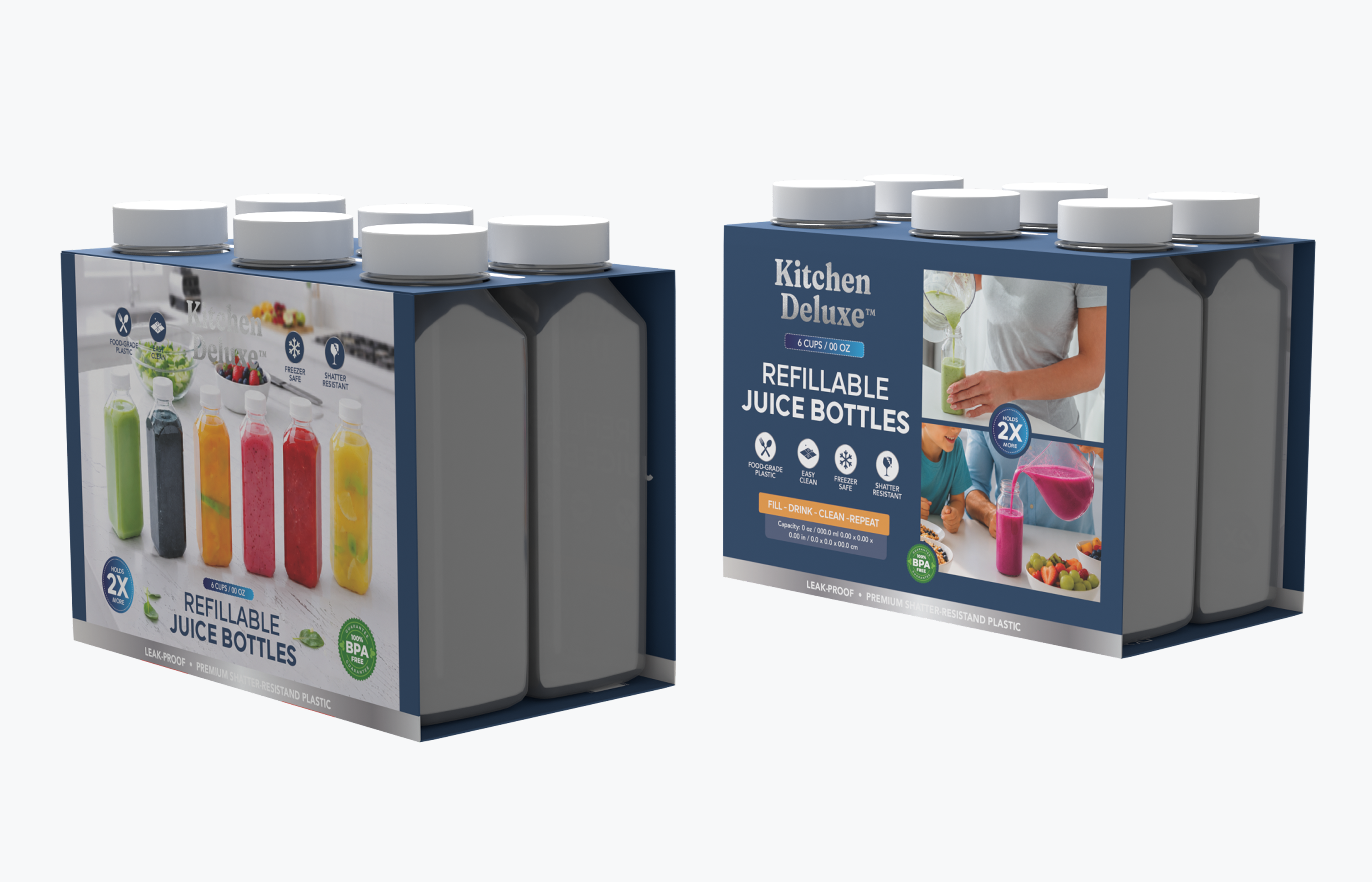
250ml & 500ml 6 Pack of Reusable Juice Bottles
Designing packaging that stands out in a crowded category by framing generic bottles as a solution-driven prep and pour system.