

Spinning Spice Rack
Kitchen Accessories Packaging Design
Designed to Win at Shelf: The Kitchen Deluxe Spinning Spice Rack
Project Details
Company
JEM International
Category
Home & Kitchen Accessories
Concept
The first thing I did was a full competitive sweep across spice racks and kitchen storage in those retailers and online. Most packaging was clinical—stainless racks on white, minimal lifestyle context, tiny capacity badges, and copy that never explained why you’d grab one rack over another. Kitchen Deluxe already had stronger “compact counter storage” positioning than its packaging was showing, plus an existing brand language I needed to build into a system.
The decision to go dark and architectural was intentional. I designed a textured near‑black frame that wraps the tower, with warm spice photography bleeding in from the edges to create a “store the flavors” halo around the product. High‑contrast silver and stainless highlights pull the tower forward while still anchoring it in a real kitchen counter context. The “Compact Counter Storage” line above the name ties the rack back into Kitchen Deluxe’s broader storage story, and the Store · Spin · Season tagline gives the front panel a clear rhythm: where it lives, what it does, how you use it.
Every icon and callout came out of real value‑mapping for this shopper and this channel. I built an icon system around space saving, smooth 360° spin, tight‑seal stainless lids that help keep spices fresher, easy‑to‑clean glass jars, BPA‑free materials, and the capacity story (holds 16 jars) so a buyer can understand scale and quality in a couple of seconds. On the sides and back, I wrote “For _” and lifestyle captions that show how the rack works in real use—weeknight cooking, baking, global flavors, 360° access—so the piece sells organization and ease, not just jar count.
Under the hood, I handled full production and structural thinking as senior packaging designer: creating the wraparound packaging structure and guidelines from scratch, aligning cutouts to the actual tower using caliper measurements, and building printer‑ready mechanicals for overseas manufacturing. That included precise dielines, fold and glue guidance, hole and window placement, bleed and safety management around the lifestyle shots, and clearly marked callouts for finishes and spot colors so vendors had everything they needed to run cleanly.
The result is packaging that feels like a Kitchen Deluxe “counter system” on shelf and online: bolder, more organized, and more lifestyle‑driven than the typical spinning spice rack, while still hitting the quick‑read features that matter in off‑price and mass channels.
The result is packaging that feels like a Kitchen Deluxe “counter system” on shelf and online: bolder, more organized, and more lifestyle‑driven than the typical spinning spice rack, while still hitting the quick‑read features that matter in off‑price and mass channels.
Next Project
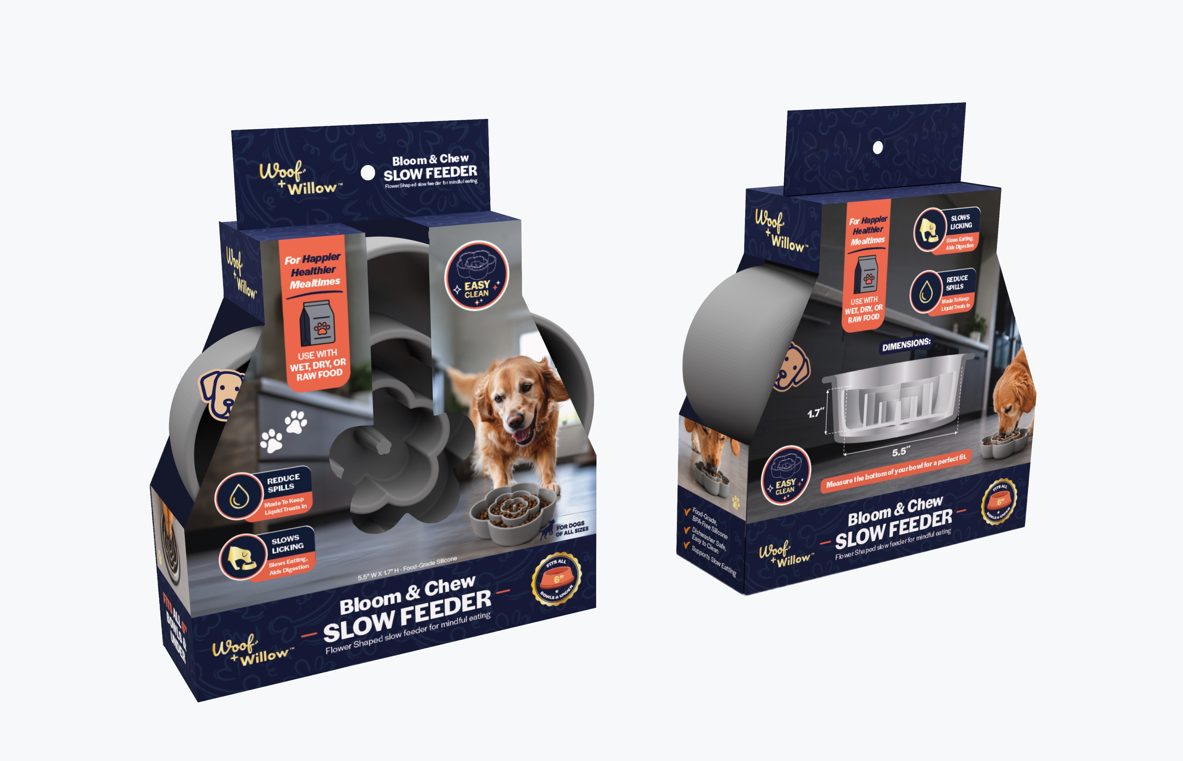
Silicon Flower Slow Feeder
A full competitive sweep across spice racks and kitchen storage shaped a packaging system built around slower, happier mealtimes.