
Silicone Flower Slow Feeder
Pet Accessories Packaging Design
Designed for Happier Mealtimes: The Woof + Willow Silicone Slow Feeder
Project Details
Company
JEM International
Category
Pet Feeding Accessories
Concept
The first thing I did was a full competitive sweep across spice racks and kitchen storage in those retailers and online. Most packaging was clinical—stainless racks on white, minimal lifestyle context, tiny capacity badges, and copy that never explained why you’d grab one rack over another. Kitchen Deluxe already had stronger “compact counter storage” positioning than its packaging was showing, plus an existing brand language I needed to build into a system.
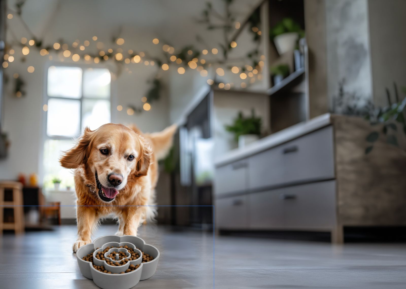
I took a flower shaped silicone slow feeder insert for Woof + Willow and turned it into a clear, conversion driven story for Marshalls. I started by looking at how slow feeders and pet bowls show up in off price retail, with lots of generic “slow feeder” claims, cluttered badges, and very little explanation of why they matter for real dogs. I also audited the packaging around this item in the Marshalls aisle, mapping what was overused such as stock photos and vague “healthy digestion” copy and where there was space for a softer, more modern voice that still respected the realities of fast, value driven shopping. From there, I framed the brief as making a silicone insert that looks cute on the shelf feel like a smart, health forward upgrade for pet parents.
Naming and hierarchy came next. Using Woof + Willow’s calm, nature leaning voice as the anchor, I explored routes like PetalPace, FlowerFlow, and Bloom & Chew, names that tied the flower motif to the promise of slower, more mindful eating without tipping into clinical language. I built sample lockups with brand first, product name second, and a simple descriptor like “Flower Shaped Silicone Slow Feeder Insert,” then tested how those sat on the front panel with a Marshalls shopper in mind. This step was about finding a balance, the name needed to feel special enough to stand out on a busy peg wall but still be instantly understandable for someone who has never used a slow feeder before.
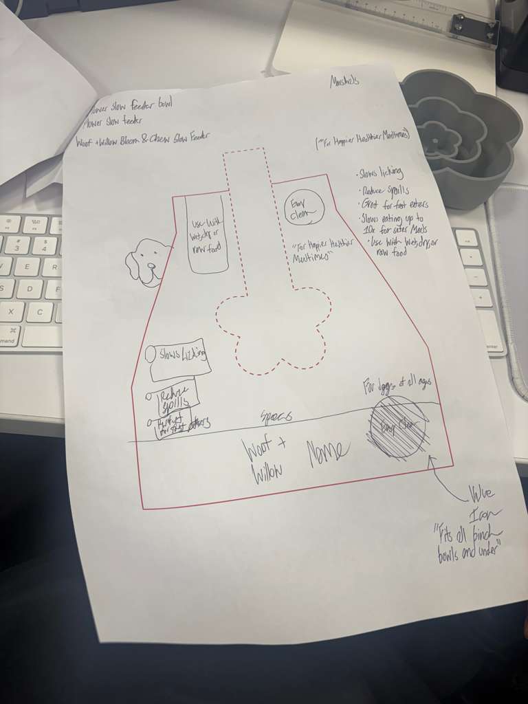
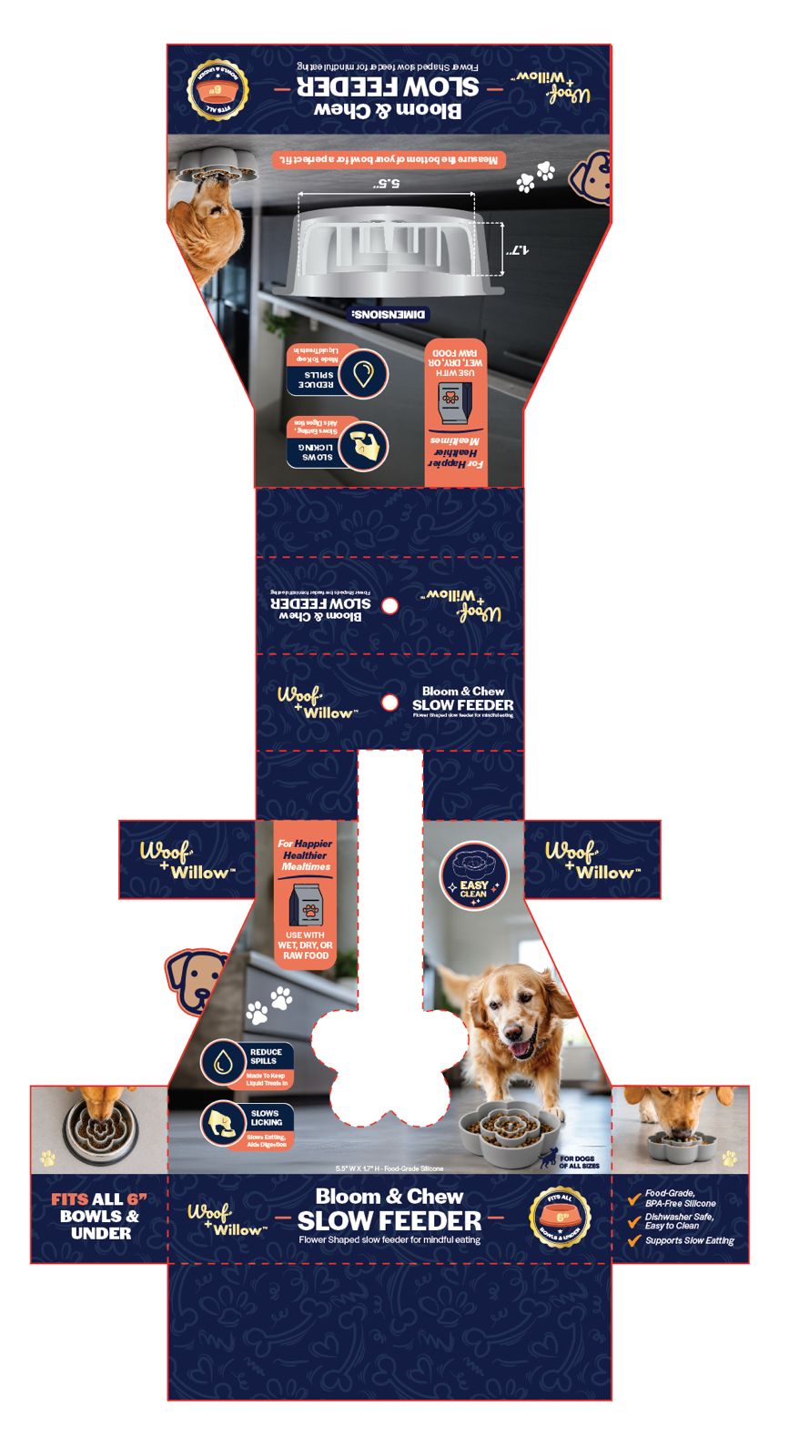
Once the structure was set, I designed the value system that would live on the front and sides. Instead of stacking every possible benefit, I narrowed the front of pack icons to four that we knew would matter in store, “Great for fast eaters,” “Slows eating up to 10× for safer meals,” “Helps reduce spills & splashes,” and “Use with wet, dry, or raw food.” I rewrote earlier ideas like “slows licking” into clearer, more shopper friendly lines, and tuned each icon so it could work both as a quick visual and as a short, readable phrase. For additional bubbles and checklists, I developed alternates around enrichment, calmer chewing, and longer treat time, so every touchpoint stayed benefit first instead of repeating the product name.
At the same time, I translated the technical details of the product into specs that would actually help someone standing in the aisle decide if it would fit their dog’s bowl. Using measurements from the prototype, I wrote a spec block that turned the drawings into plain language, approximate diameter and height, material callouts like food grade, BPA free silicone, and a simple fit statement such as “Fits most bowls 6 inches wide & under.” I iterated this down from a longer technical version to a shorter line set that worked inside an icon or small panel, keeping just enough information so the shopper could judge size and compatibility in a couple of seconds.
From there, I looked at how the overall story felt as a piece of packaging, not just as a list of claims. I tuned the front descriptor and supporting copy to emphasize the emotional payoff, safer, calmer, more engaging mealtimes, while still grounding everything in visible features like the flower maze pattern and the flexible silicone. In parallel, I made sure the voice stayed distinctly Woof + Willow, gentle and reassuring rather than shouty, but still clear enough for Marshalls’ fast scan context. That meant editing lines down, harmonizing verbs across all the icons, and making sure nothing sounded either too clinical or too baby
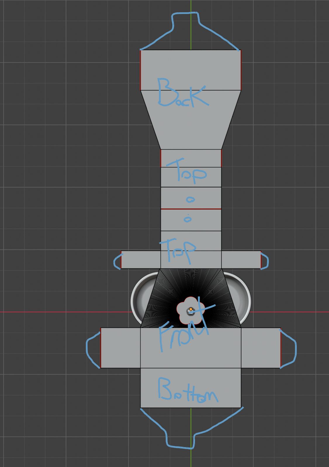
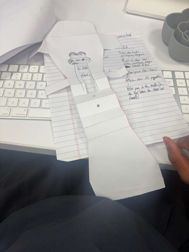
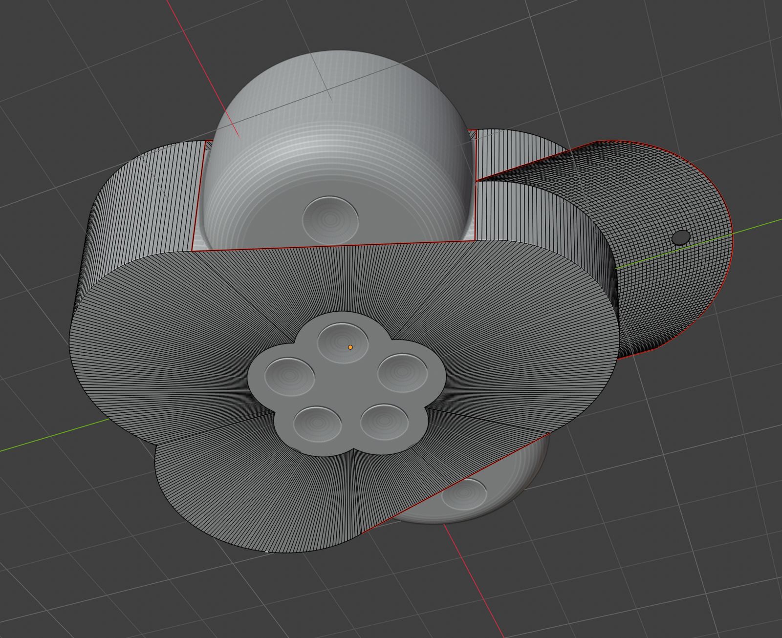
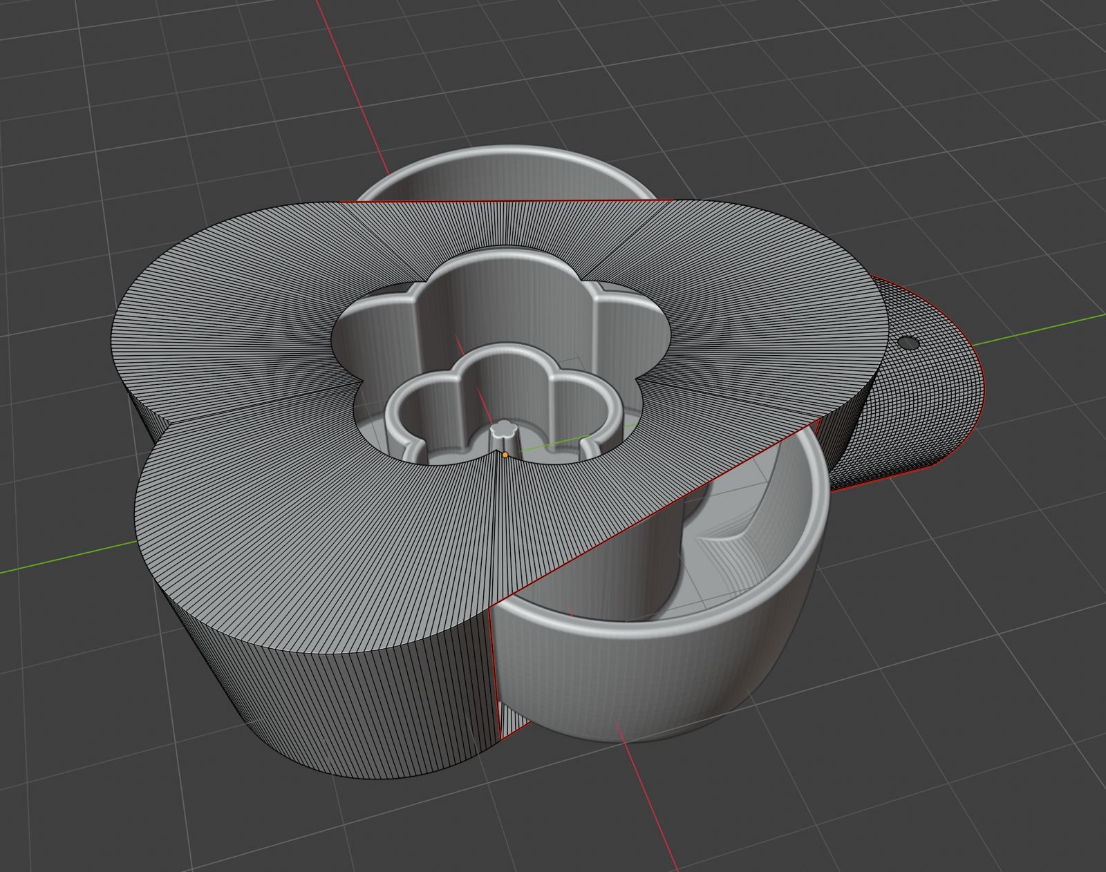
Under the hood, I approached this the same way I handle my more structural projects. I laid out the dieline so the product window, icons, and type hierarchy supported the physical shape of the insert, leaving room for manufacturing marks and legal copy while still giving the front panel breathing room. I prepared print ready artwork and spec notes that captured the final callouts, material information, and any production nuances, so the factory could move straight from my files into proofing. The end result is packaging that does not just decorate a cute slow feeder, it explains what it does, why it matters for fast eating dogs, and how it fits into a real kitchen, in language and visuals tuned for an off price pet aisle.
Design Development


Next Project
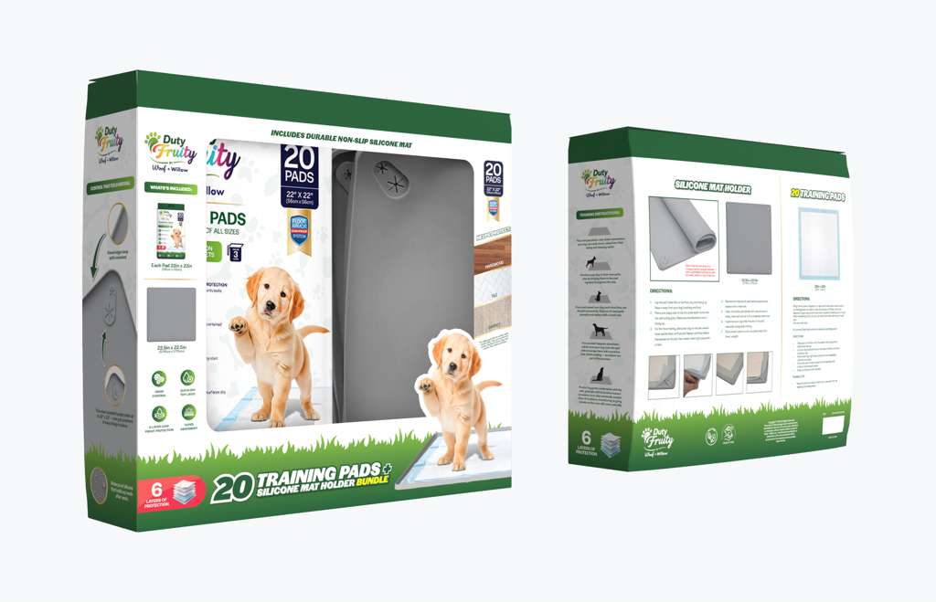
2-in-1 Training Pad + Silicone Mat Bundle
Built to show pad and mat working as one system, not two unrelated parts.